Last updated on July 11th, 2023 at 04:37 pm
Explore These 6 Ways to Organize Your Website Content
A website can showcase what you have to offer to your potential clients. One of your main objectives is to allow your target audience to quickly find what they need.
Aside from providing valuable and informative content, it’s also a priority to keep everything organized. When you give the visitors a hassle-free experience with clear paths to purchase products or access to information, you can keep them on your site and they might even come back for more.
Although, keeping your content organized can be challenging due to the variety of visitors with different expectations. Thus, here are several ways to organize website content in the best possible way.
1. Identify The Crucial Elements
If you want to ensure a good user experience for your website, identify these three elements to ensure a good starting point in organizing your website.
- Brand: Knowing your brand will help set the pace. Once you have a well-established brand identity, it allows you to establish consistent communication on all platforms.
- Call to Action (CTA): You also need to identify what you want your visitors to do once they visit your website. Doing so will provide you with a better understanding of how to organize your content correctly.
- Target Audience: Depending on the main focus of your website, you might be catering to a variety of audiences. Knowing more about your target audience will provide you with an insight into how they see your content. Additionally, having a solid understanding of your target audience and their specific needs can help you figure out the type of content to include on your website.
Always remember that knowing these three elements will help you organize your website content better.
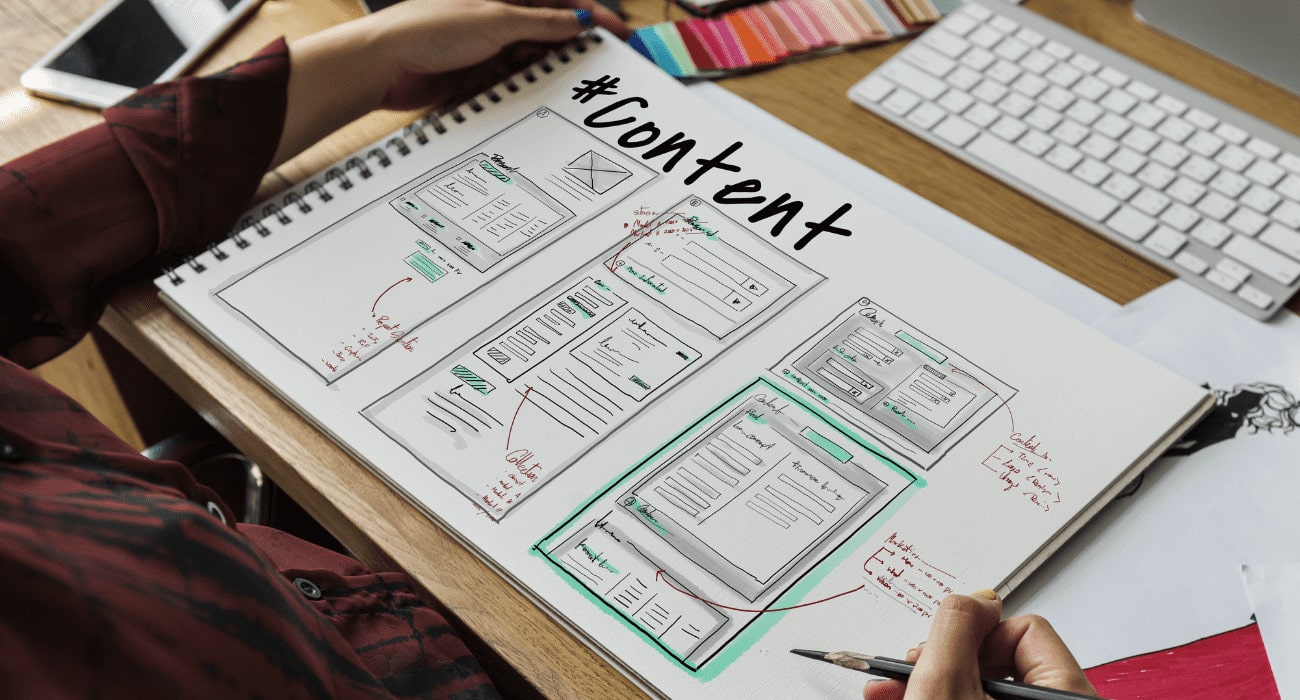
2. Create An Organized Sitemap
After identifying the crucial elements to help you decide on the right content and framework for your website, the right arrangement is the next step. An organized website will provide your visitors with a good experience, and you can achieve this with the help of a sitemap.
When planning your website content and sitemap, you have a few considerations to think about.
- Create a Logical Outline: Make sure to organize the content into logical groups. In most cases, you can categorize your services into separate groups. If you have several service umbrellas, you need to divide them as well. This will keep your website organized. Additionally, it’ll make it easier for visitors to find what they’re looking for and allow you to be precise in the call to action to use.
- Achieve a Simple Look: The website hierarchy shouldn’t be a complex one. If you want your website to be productive, you only need the basic pages. This includes the homepage, service or product page, about us page, and contact page. Extra add-ons you might want to consider are a portfolio, a blog, a testimonial page, and an online store.
Creating an organized sitemap right from the start will keep everything in order. When you organize the website content before its aesthetics, you can build the design around the content structure.
Thus, ensuring an effective and profitable website.
If you need assistance in organizing your content, checking out reliable providers of sitemap services would be a good start. Thus, you’ll be able to learn how to plan a website structure in the most effective way.
3. Start With The Critical Content
Now that you have a clear outline for your content, you need to decide what to showcase in your content.
The priority is to start with the most critical content.
Try to think about what your visitors have in mind when visiting your site or offer a clear starting point on the landing page. Then, you can think about the less important content and decide where to position or arrange them on your site.
Visitors will always start at the top of the page. Take this into consideration and make the most out of the area by showcasing the main content. This could also be used to answer the fundamental questions of your visitors or entice them to click on a link or check your page.
4. Display Relevant Content
When organizing the website content, make it a priority to show the relevant ones. Although this seems straightforward, many websites fail to maintain the objective of keeping their site simple.
Come up with a clear idea of the path your visitors take to reach their objectives. Don’t forget to be well aware of the various phases they’re in. Once you’re able to draw visitors to your website, provide them with the right content.
5. Maximize The Landing Pages
The landing pages on your website convert visitors into actual leads. Always remember that the primary purpose of a landing page is conversion.
With this in mind, make sure to avoid adding any elements that’ll distract the visitors. An effective landing page is crucial for your marketing efforts.
A good landing page should grab the attention of your visitors and compel them to complete a conversion. All the elements in the landing page must work together seamlessly to ensure conversion.
This could either be answering a form, registering for a newsletter, or buying a product.
Additionally, the landing page should provide relevant information to encourage visitors to convert without any distractions or unnecessary redirections.
6. Establish Seamless Navigation
After determining the content suitable for your site and working out with what you already have, it’s time to construct your website’s navigation.
Generally, navigation refers to a collection of menus visitors use to move around your site.
In most cases, the navigation bar is right on top of the site. The navigation bar can comprise one menu bar, a single menu bar with tiered drop-downs, or a combination of multiple navigation elements.
There are several considerations to remember to make it easier for visitors to go around your site:
- Select a Navigation Structure: This should best suit the size of your website. If your website contains limited content, a simple navigation bar will work. As for an e-commerce site, it would require a bigger one or a vertical collapsible menu.
- Provide Descriptions: This must be in the navigation titles. Be specific when building your navigation menu, which your visitors will significantly appreciate so they’ll know where to go.
When you provide convenient navigation for your visitors, they can readily go to the right page to find what they need.
Conclusion: Ways to Organize Website Content
A well-organized website content clearly shows you genuinely care about the visitor experience on your site and value their time.
When your visitors find what they need on your website in a seamless and hassle-free manner, it’ll encourage them to return. Aside from drawing in quality visitors to your website, an organized website will improve search engine rankings.
It could also elevate user experience and convert visitors into customers in no time.


